Catholic Charities of Baltimore Brand and Style Guide
This style guide is intended to ensure consistent application of the Catholic Charities brand identity in internal and external communications.
Brand signatures include the proper use of logos, colors, typography, taglines and more.
By requiring adherence to these standards, we help establish and maintain a strong visual identity in the marketplace.
In addition to the Catholic Charities agency brand, its Divisions, such as Community Services, and its programs that possess strong individual brand identities, such as Our Daily Bread Employment Center, have their own logo signature. If you are in need of a specific program or division logo, contact the Communications Department at 667-600-2010.
Please read through these guidelines and contact the Communications Department at 667-600-2010 with any questions or requests.
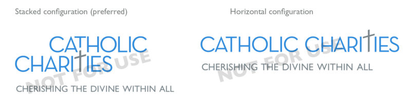
The Catholic Charities logo is clean, simple and yet very unique. It consists of a cross icon that is subtlety placed in the typography becoming both a symbol and the “T” in CHARITIES, The cross is grounded in the word “Charities” to make the important point that Jesus Christ, His teachings and our Catholic identity are the source of inspiration for the charitable work we perform. The logo has 3 versions, a stacked, horizontal and an alternate configuration and all include the tagline, CHERISHING THE DIVINE WITHIN ALL. The primary stacked configuration is preferred and should be used whenever possible. The horizontal or alternate configurations should only be used when space does not allow for the stacked configuration.
Please note:
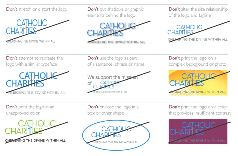
- Never attempt to recreate or alter the logo; always use the approved electronic files. See examples of incorrect usage below.
- Keep the required minimum clear space. See examples below.
Minimum sizing, placement and clear space
Since there is a range of signatures, spacing requirements will vary. Signatures with more words will maintain the same minimum width but the type point size will be slightly smaller. This is to maintain a consistent space used for the signature.
- The primary stacked logo should not be smaller than 1.75″ in width.
- The primary horizontal logo should not be smaller than 2″ in width.
- Keep a generous amount of clear space all around to keep the signature free from distracting elements. The formula for the minimum amount of space is 5x the cap height of the tagline (x). Use more space whenever possible, especially when there are other competing graphics elements near the logo.
![]()
Examples of incorrect usage
Downloadable Primary Stacked Logos
EPS (Vector format for highest resolution for printing and transparent background )
- Primary Stacked EPS Vector PMS
- Primary Stacked EPS Vector Black
- Primary Stacked EPS Vector Gray
- Primary Stacked EPS Vector Reverse for Transparent Background
PNG (For web use and transparent background)
- Primary Stacked PNG PMS
- Primary Stacked PNG Black
- Primary Stacked PNG Gray
- Primary Stacked PNG Reverse for Transparent Background
JPG (For web and Powerpoint use)
Downloadable Primary Horizontal Logos
EPS (Vector format for highest resolution for printing and transparent background )
- Primary Horizontal EPS Vector PMS
- Primary Horizontal EPS Vector Black
- Primary Horizontal EPS Vector Gray
- Primary Horizontal EPS Vector Reverse for Transparent Background
PNG (For web use and transparent background)
- Primary Horizontal PNG PMS
- Primary Horizontal PNG Black
- Primary Stacked PNG Gray
- Primary Horizontal PNG Reverse for Transparent Background
JPG (For web and Powerpoint use)
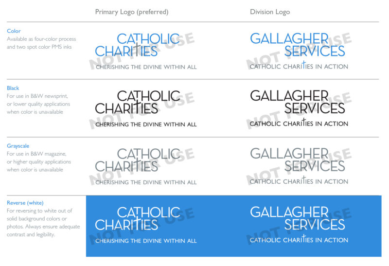
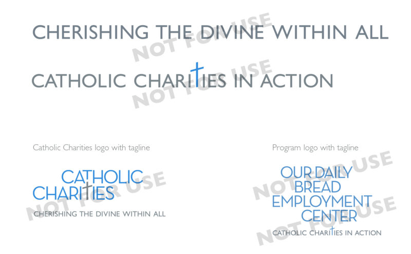
In addition to the standardized brand signatures, there are two taglines that are to be used consistently and exclusively, but only in conjunction with the entire logo. The tagline should not be used as a stand-alone item.
- CHERISHING THE DIVINE WITHIN ALL is applied only to the Catholic Charities logo. The line should never be used as the tagline for Divisions or Programs.
- CATHOLIC CHARITIES IN ACTION is the appropriate tagline applied to Divisions and Programs. No taglines other than these two should ever be applied to our brand signatures.
The Catholic Charities signature consists of a cross icon that is subtly placed in the typography, becoming both a symbol and the “T” in CHARITIES. The cross icon can be used as a stand-alone graphic element, but should not be overused or placed randomly. When using the cross icon as a stand-alone, the preferred style is to place it in a corner or along the edge so part is bleeding off the edge. If you wish to use this icon, please contact us first. 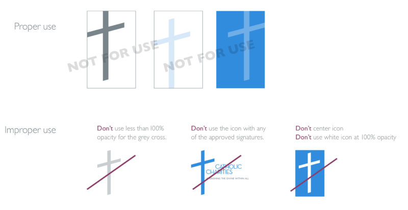
The entire logo with the tagline is the preferred use, however, the tagline may not reproduce well when printing it on fabrics, such as shirts. The tagline on hats is questionable, it depends on the production process. To keep things clean and readable do not include the tagline if the type is too small. The golden cross is
to be used for signage and promotional products only. When using the golden cross, choose only deeper hue backgrounds to ensure maximum contrast. Avoid using the golden cross on brighter hue backgrounds, such as white and other light colors. Promotional materials should use colors or closely matching ones in the Catholic Charities color palette.
Please contact the Communications Department at 667-600-2010 for questions or requests.
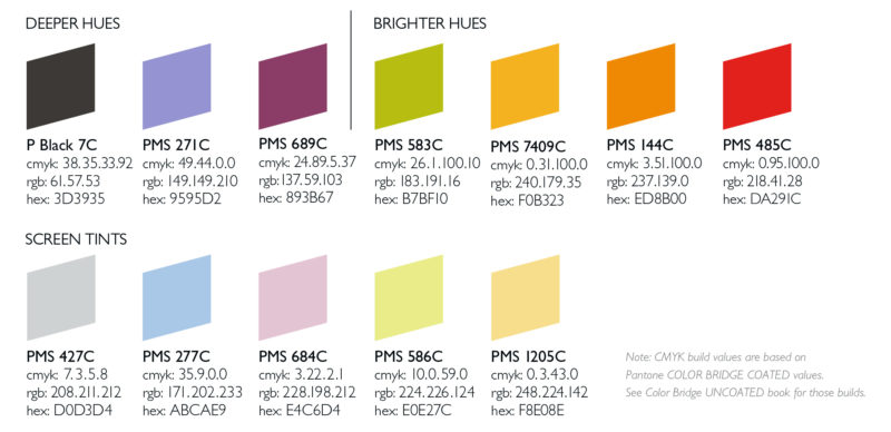
The effective use of color is critical in conveying the brand personality of Catholic Charities. In addition to the blue and gray used in the logos, an extended family of colors has been created for use in all communications/projects. These colors reflect the color palette of the Catholic Charities website. Deeper hues are more appropriate for large solid areas, while brighter hues should be used sparingly or as highlight colors. Screen tints may also be used as needed.
 |
 |
|---|---|
| PMS 430C cmyk: 33.18.13.40 rgb: 124.135.142 hex: 7C878E |
PMS 279C cmyk: 68.34.0.0 rgb: 65.143.222 hex: 418FDE |
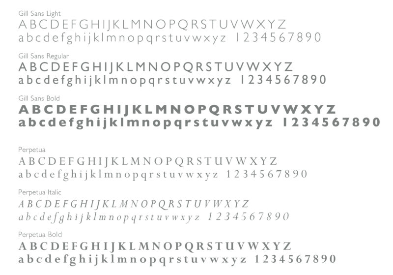
The Gill Sans typeface has been chosen as the preferred typeface for Catholic Charities’ online and printed communications.
When Gill Sans is unavailable, Helvetica or Arial may be substituted.
For large amounts of text, the Perpetua typeface is preferred. When Perpetua is not available, Times New Roman may be substituted. For general use, in creating documents, emails, etc., Catholic Charities employees should use the Arial font. Headlines should be set in at least 18pt Arial Regular and body text should be 9 or 10pt Arial Light or Regular.
Neutra Text typeface is only for logos and is NOT to be used for any other type of communication. Arial and Times New Roman are standard fonts on all computers.